Design isn't just about being pretty; its about designing for practical solutions, improving experiences and enriching the quality of life. With the release of
Index Braille's V4 embosser line the goal was to take braille printing into the 21st century and offer the visually impaired a whole new level of product experience. And this is something we believe we have managed to obtain through well planned design and meaningful product features.
By adding innovation and usability techniques Index Braille has been able to offer the V4 product series not only with a purposeful design, but also equipped with features that follow customer demand. If we begin by concentrating on the design aspect of the V4 braille embossers you will find that it is self-explanatory in terms of both visual and tactile usage.
If the design process of Braille Box V4 is taken as an example, Index Braille worked directly with industrial design agency Skapa Design. Our industrial designers explain their methods as "design for the hand," meaning the design makes it easier for users to know which parts should be used. During the design process it was clear that not only the physical appearance of the design was important, but also that the functionality and understanding and use of the machine were to be well depicted by both sight and touch. Simply, we needed to address the usability needs of both our sighted and visually impaired braille embosser users.
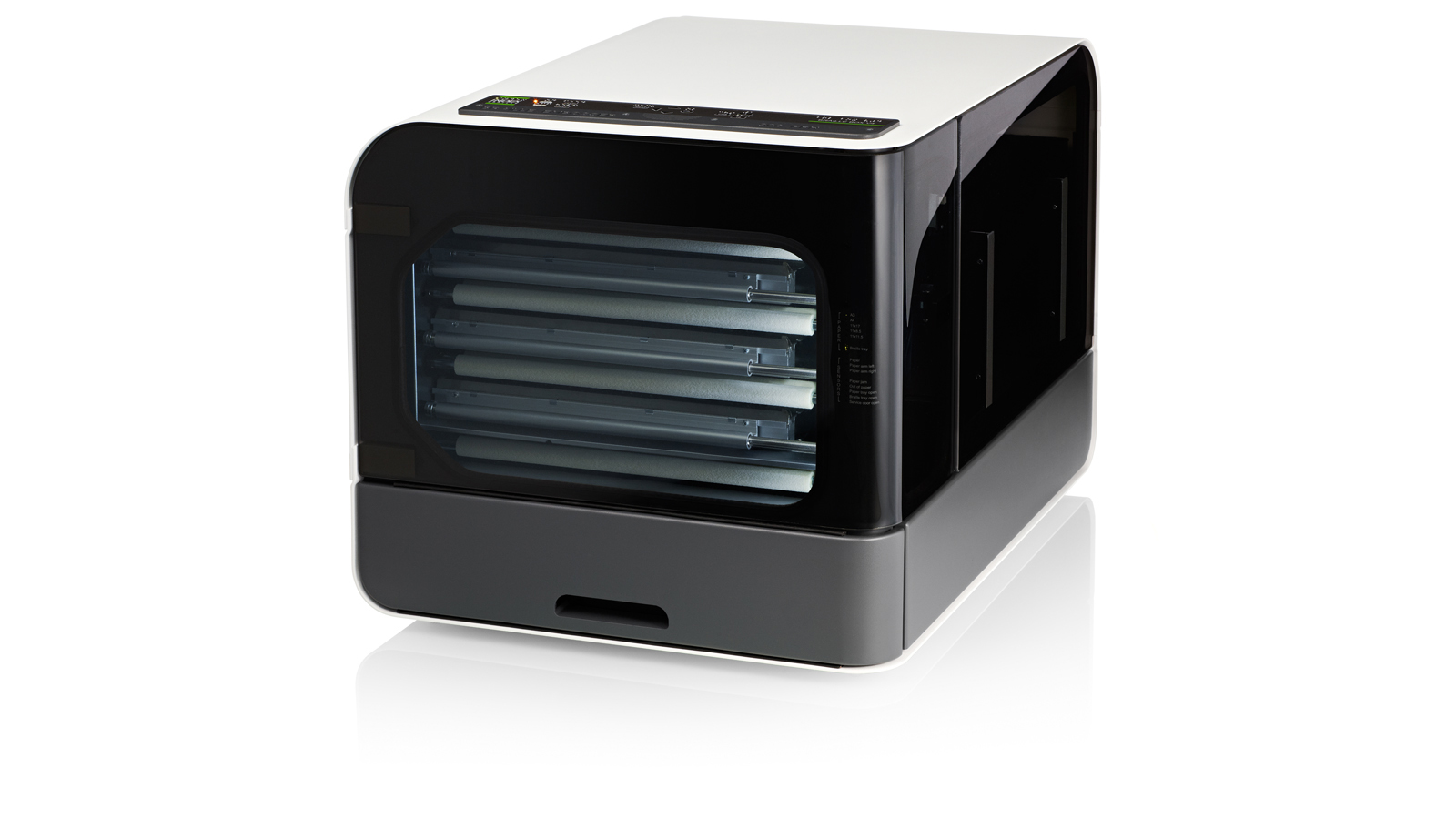
Braille Box V4
Index Braille has been promoting cut-sheet paper for years now. As the ink printer market has left tractor feeding behind, so will the Braille embosser market in the years to come. In fact this is a shift we have already begun to see as cut-sheet paper only costs a fraction of the price of standard "braille paper" and is available at any local office supply store. The sheet feeder technique is something Index embossers have been managing for years so with the V4 upgrade it only made sense to include a braille production embosser in which uses cut-sheet paper; this is when the Index Braille Box V4 was born.
The goal behind Braille Box's design was to become a market influencer following our strong beliefs behind cut-sheet paper, meanwhile keep the braille printer as a self-contained unit in order to reduce the noise level that is generally produced when embossing braille. Additionally we did not want to resemble a rebuild of an aged traditional printer, but bring the braille embosser market some life and meaning behind these fascinating machines.
The Design Explained- [Skapa Design Studio]
The clear-cut form of Braille Box V4 highlights the aspect of speed, while the use of aluminum and laminated glass render a high-grade and solid impression. Distinct lines and aluminum plates also contribute to a clear design. The box's asymmetrical shape and choice of materials and colors serve to enhance tactile and visual perception as well as to facilitate operability for visually impaired users.
The two surface areas, clearly differentiated by color, add direction and a certain weightiness while simultaneously reducing the perceived size of the unit. A recess at the backside provides a space for all wiring so that the printer may be placed in a corner without pinching any cables.
Modern technology and design details appreciated by the blind and visually impaired:
Shape - The asymmetrical shape and structural differences between materials tells the blind user how to handle the product.
Lights and color - Some visually impaired individuals are able to perceive light and color contrasts. To give these users an extra verification on which state the braille printer is in LED lights that blink when an error occurs were added.
Black and white offer the greatest color contrasting. The contrasting colors and light coding were used to introduce places of usability. Areas where the user can interact with the braille embosser are black (or dark gray) and areas that are not for interaction are white.
Interface - The interface has braille text and speech feedback (in several languages) to make it easy for the visually impaired user to interact with the embosser.
After a successful design was in place, Index was left with the task of testing and a process of many technical improvements along the way. Braille Box finally reached the market in the beginning of 2011. In the spring of 2011 Braille Box V4 received the Red Dot Design Award and then proceeded to achieve a number of internationally renowned awards in 2012 such as the People's Choice - Grand Award of Design (SWE), The German Design Award (GER), Design S (SWE), and the Good Design Award (USA).
Interested in receiving braille printouts on the cut-sheet paper?
Request a braille sample and we are happy to introduce you to the future of braille printing.